
Keeping people in context
A concept that opens File Manager and phpMyAdmin inside the hosting dashboard instead of sending you to a different app.
The problem
In Hostinger's hPanel, clicking File Manager first asks which files you want, then opens a separate app in a new tab with its own look and no sidebar. You lose the site you were working on. phpMyAdmin does the same.
How it works today and why
While exploring this, I stopped and thought: surely their design team has noticed this, so there must be a reason. Digging in, I found that both tools are open-source apps Hostinger plugs in rather than builds, so restyling them would mean maintaining their own copy of the code through every update. Running them on separate web addresses also walls them off from the rest of your account, so a security problem in one can't spread. And phpMyAdmin has far more features than a dashboard could ever rebuild. So the question became: how do I keep people in the dashboard without rebuilding these tools?
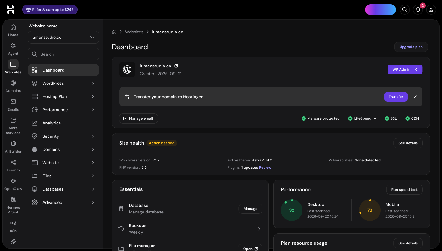
Everything about this site in one place.
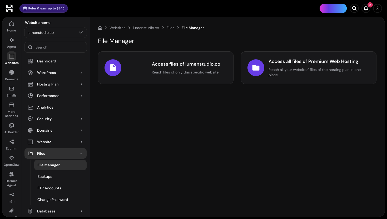
"This website" or "All websites"? An extra decision before any files appear.
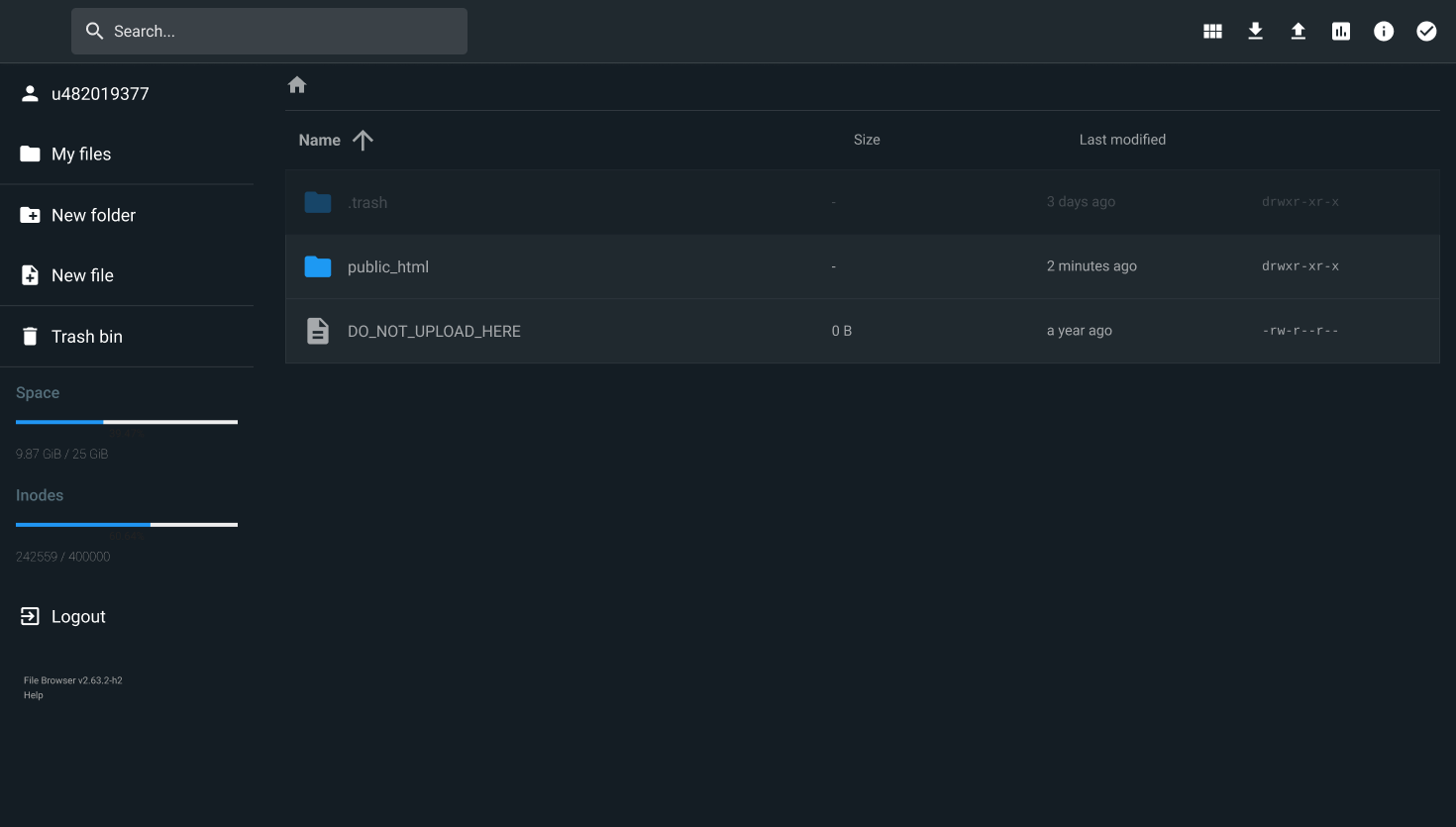
A different app with its own style. No sidebar, no site context.
The obvious fix was "just put it in the dashboard". The better question was why it isn't there already.
Looking for the constraint first changed the brief from "rebuild the file manager" to "decide what belongs in the dashboard". That's a smaller, cheaper and more believable change, and it respects the people who rely on the full tools.
Why this is a better experience
The everyday tasks move into the dashboard, and the full tools stay one click away.
- You stay where you were. The sidebar, breadcrumb and site name stay put, so there's no tab to find your way back from.
- One less decision. "This website / All websites" becomes a toggle on the same screen, not a page you have to get past.
- It looks like the rest of hPanel. Same colours, type and components, so nothing feels like a different product.
- Power users lose nothing. "Open full file browser" and "Open full phpMyAdmin" are always there.
A separate app in a new tab, with its own look and no site context.
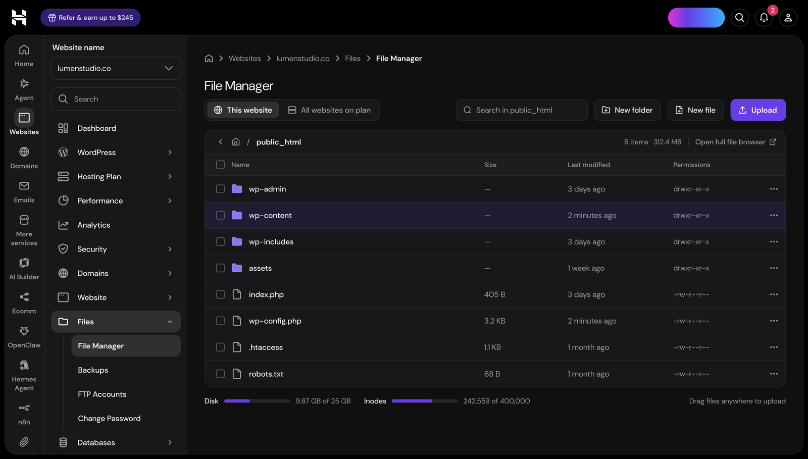
Files open inside the site’s dashboard, with the sidebar and breadcrumb still there.
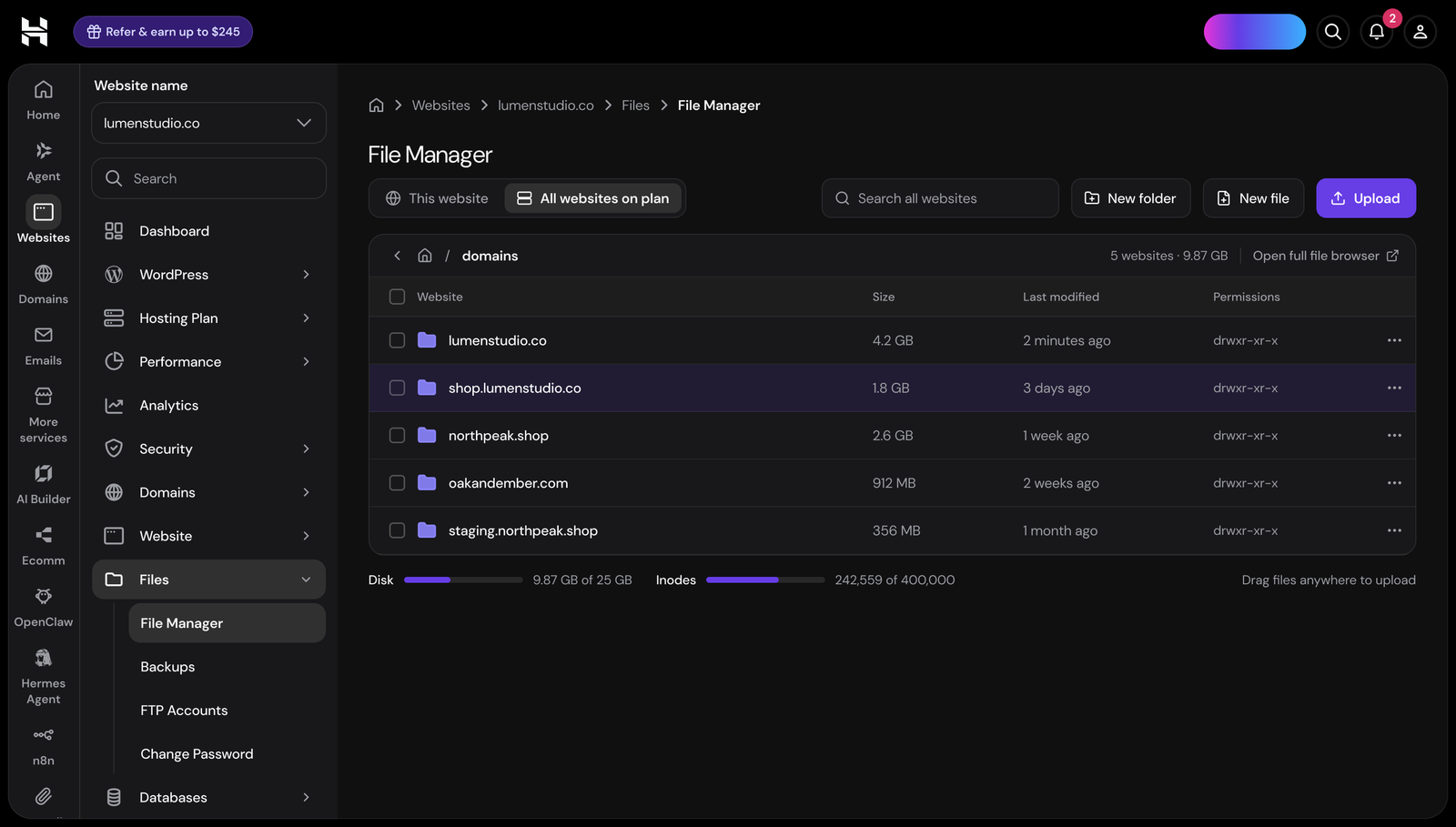
One toggle switches to every site’s folder, no extra page.
The same idea for databases
phpMyAdmin is built for power users: writing SQL, changing how tables are structured, managing users and permissions. But most people who open it only want to check a table, look at a few rows or export a backup, and for that the full tool is a lot to take in.
So the dashboard gets a simpler view for those everyday jobs, in the same place and style as the rest of your site. Nothing is taken away: anyone who needs more is one click from the full phpMyAdmin, exactly as it works today.
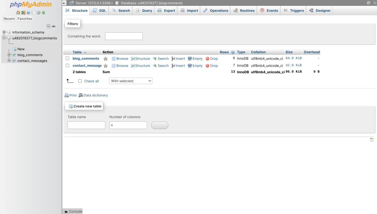
Powerful, but dense, and in its own app.
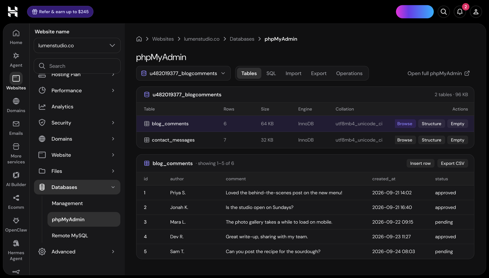
Pick a database, see its tables, preview rows and export, right next to the rest of your site.
Next, I'd test how often people still open the full tools. If most never need to, the simpler view is doing its job.
A self-initiated concept. Not affiliated with or endorsed by Hostinger. All names and data are placeholders.