
SHEIN Order Tracking Experience
A redesign of SHEIN's order tracking journey, focused on reducing confusion, making delivery progress easier to understand, and giving users clearer next steps when an order goes wrong.

Overview
Turning a frustrating delivery moment into a clearer support experience.
As a user, I faced significant frustration trying to track an undelivered order on the SHEIN app. The process was confusing, time-consuming, and left me feeling stuck at several points.
As a designer, I saw an opportunity to rethink the experience and make it clearer, calmer, and more user-friendly. I applied principles from Don Norman's The Design of Everyday Things, especially mapping, feedback, affordance, and user control.
Problem
The tracking experience did not match what users needed in a stressful moment.
- Unclear order details: a fixed WhatsApp subscription announcement competed with critical order information and could not be dismissed.
- Misleading tracking link: a link labeled "View detailed information for USPS" suggested more order detail, but only surfaced carrier contact information.
- Limited delivery visibility: the app did not provide a clear visual timeline or enough status feedback when the order was delayed.
- No clear resolution options: when an order was not delivered, the user had to rely on customer service instead of resolving the issue in the app.
Deeper process Detailed screen decisions for order details, tracking, resolution, and UI refinement.
Order Details
Cleaning up the order details page.
The first redesign move was improving the order details page. The WhatsApp banner was visually loud and competed with the information users came for: item details, order status, and next steps.
Before
The page felt visually overwhelming, with promotional content competing against critical order details.
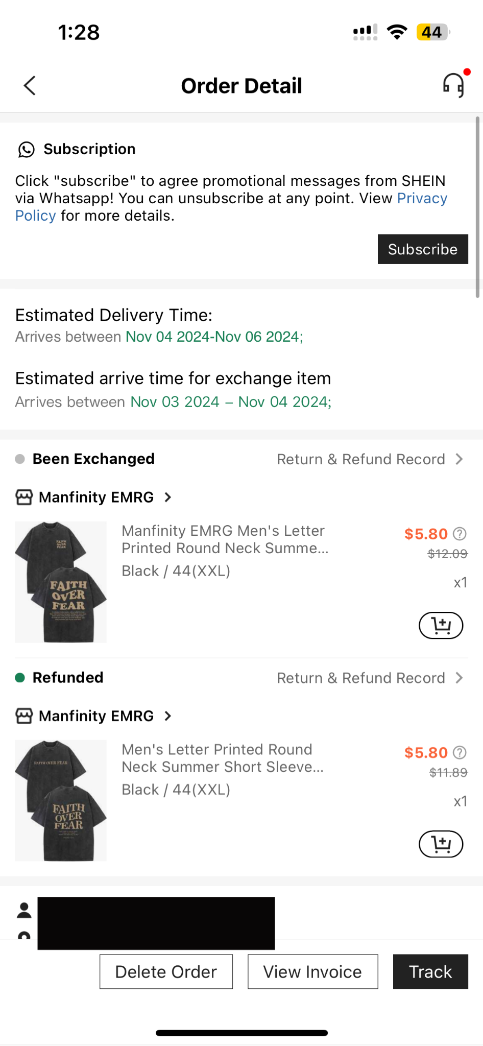

Redesign
I added a simple close control to the WhatsApp announcement so users could dismiss it when it was not relevant. This reduced banner fatigue while still allowing the message to serve its business purpose.
I also simplified the layout around what mattered most: the item purchased, order details, and clear recommendations.


Tracking
Making the tracking page match users' mental model.
When I clicked "View detailed information for USPS," I expected to see more about my order's status. Instead, I saw carrier contact details. The label and the result did not match, which broke trust.


The redesign keeps users in the app and provides frequent status updates through clearer breadcrumbs. The goal is to help users quickly understand where their order is, even when there is a delivery problem.
Resolution
Giving users control when an order is not delivered.
When my order was not delivered, I felt stuck. I could not reschedule delivery or cancel the order directly in the app, so the experience pushed me toward customer service.
I added direct actions for rescheduling delivery or canceling the order. This gives users an immediate path forward instead of leaving them to figure out what to do next.

UI Refinement
Polishing the visual direction around trust and usability.
While the core redesign focused on trust, personalization, and usability, I also refined the visual design to better match the standards users expect from fashion retail apps.
I explored a refreshed UI prototype and interactive product moments, including color switching, to make the shopping experience feel more engaging.
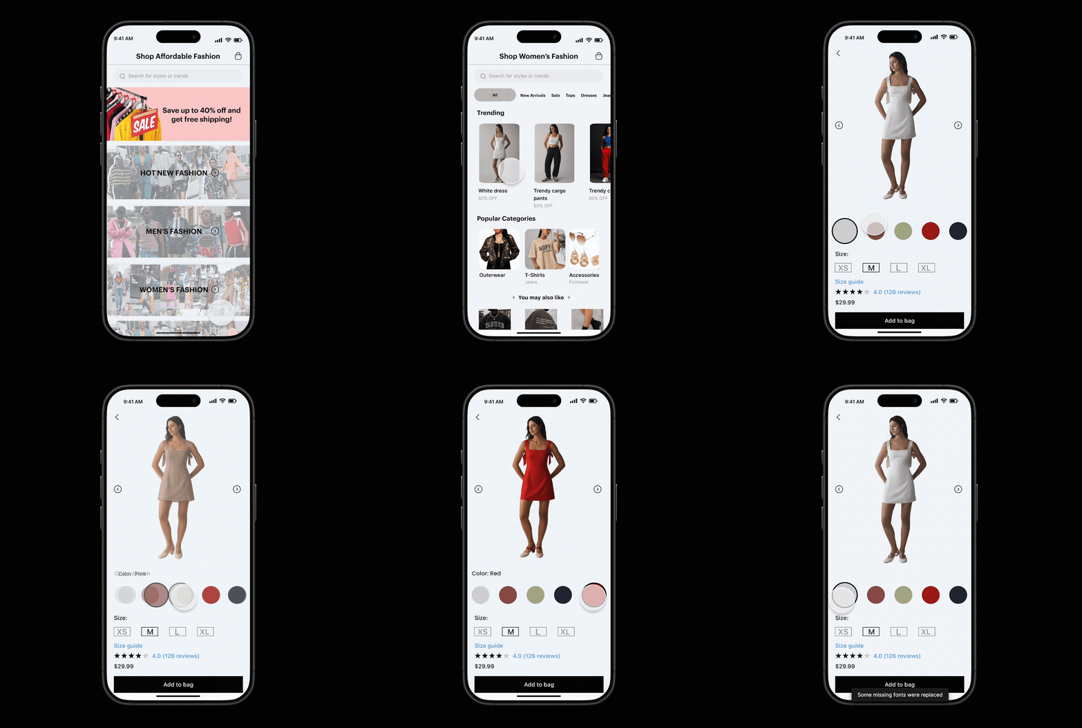


Takeaways
Small details can change the whole support experience.
Mapping: labels should match what users expect to happen next.
Feedback: status breadcrumbs help users understand delivery progress without guessing.
Affordance: reschedule and cancel actions make next steps clear when something goes wrong.
This project reminded me that small design details can have the biggest impact on how supported a user feels.