AI Healthcare Companion hero mockup

AI Healthcare Companion

Revisiting a healthcare AI concept with stronger visual hierarchy, accessibility, and a design direction better suited for patient-facing experiences.

Role: UX/UI Designer Course: Human-AI Interaction Platform: Mobile App Concept
Redesigned AI Healthcare Companion screen

After completing the initial design for this AI-powered healthcare companion, I revisited the project with a fresh perspective, both visually and strategically.

The original version was created under tight time constraints as part of a group project. It worked functionally, but it lacked the level of visual polish and healthcare-specific clarity I knew it could reach.

Since then, I’ve grown in how I think about accessibility, visual hierarchy, UI consistency, and emotional context. I wanted the project to reflect that growth.

Why I Redesigned It

There were three main reasons I came back to this project.

  • Time constraints: the original version was produced quickly and lacked visual refinement.
  • Feedback: conversations at Figma Config reinforced how important strong visual design is when presenting work.
  • Personal growth: I had developed a better understanding of accessibility, visual hierarchy, and interface consistency.

Dark Mode to Light Mode

The biggest strategic change was moving from dark mode to light mode.

After more research, I made that shift intentionally. It was not just a visual preference. It was about the user’s environment and emotional context.

Who’s using this, and in what environment? That question now shapes my design decisions much earlier.

Key Design Decisions

1) Designing for healthcare context

Light mode is often better suited for healthcare products because it improves readability for patients and clinicians, aligns more closely with existing medical systems, and reduces the emotional heaviness dark interfaces can sometimes carry in already overwhelming health contexts.

This redesign pushed me to think less about what looked dramatic and more about what felt calm, clear, and usable for real people.

2) Simplifying color and improving readability

The original version relied on too many colors in the vitals section and across the UI, which made the interface feel visually heavy.

  • A calmer primary color reduced distraction.
  • Spacing and padding were adjusted for better readability.
  • Visual groupings were clarified so information felt easier to scan.
  • Component styles became more cohesive across cards, toggles, and actions.

3) Accessibility as a core design constraint

I used the redesign as an opportunity to bring the interface closer to WCAG-friendly contrast and more reliable legibility across the experience.

This was also a reminder that healthcare products cannot rely on aesthetic preference alone. The interface needs to hold up when users are fatigued, stressed, or under pressure.

  1. Reduce unnecessary color variation.
  2. Strengthen hierarchy with spacing and clearer groupings.
  3. Keep states legible in both light and dark explorations.
Original dark mode concept
Original dark-mode concept.
Redesigned light mode concept
Light-mode redesign.
Deeper process The original concept, four-stage design process, AI integration, and ethical safeguards.

Initial Project

This project was developed as part of my Human-AI Interaction class at Drexel University. The AI Healthcare Companion is a conceptual design for an intelligent system aimed at improving chronic disease management and emergency response.

It reflects my interest in blending user-centered design principles with AI technologies to solve real-world healthcare challenges.

AI Healthcare Companion initial project demo
Initial project concept demo.

Problem Statement

Managing chronic or terminal conditions often means dealing with medication schedules, frequent doctor visits, and unexpected emergencies.

Many patients struggle with independence because of these challenges, creating a need for a supportive, intelligent system that helps both them and their caregivers.

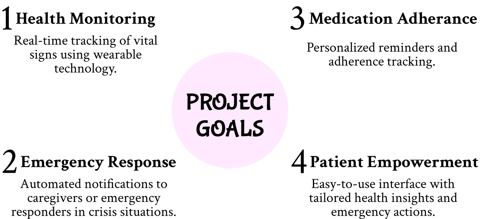
Project Goals

Problem framing and project goals graphic Problem framing and project goals graphic optimized for dark mode
Problem framing and project goals.

My Design Process

1) Exploratory research

We conducted research into stakeholder needs and the technology landscape to better understand challenges faced by chronic patients and caregivers.

  • Patients struggled with remembering medication schedules and managing sudden crises.
  • Caregivers had difficulty coordinating responses during emergencies.
  • Existing solutions often lacked integration or had usability issues.

2) Conceptual design

We ideated several potential solutions and selected the AI Healthcare Companion for its feasibility and potential impact.

Core features included wearable integration, emergency escalation, and AI-driven scheduling for appointments and medication reminders.

  1. Map data flows and user interactions.
  2. Identify ethical design considerations early.
  3. Define how AI behavior would surface in the interface.

3) Low-fidelity prototyping

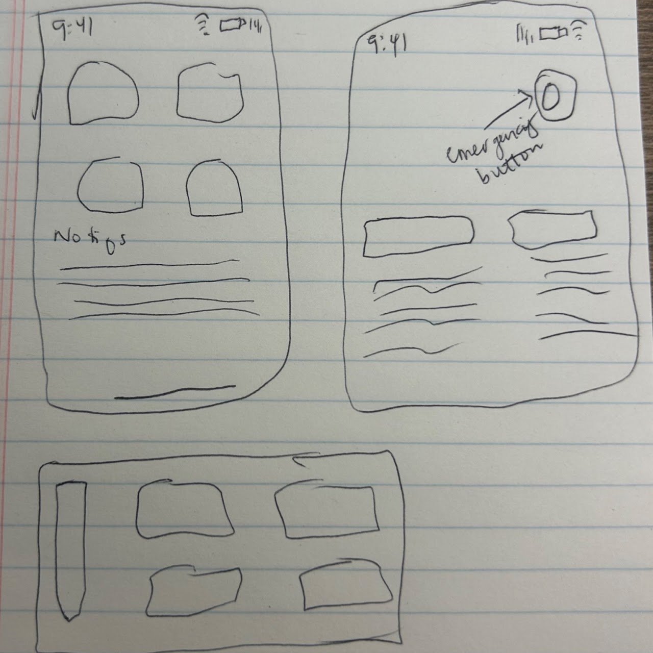
We sketched basic wireframes to outline user flows and critical touchpoints, including a vitals dashboard, emergency alert panel, and personalization settings for thresholds and notifications.

Low fidelity wireframes for AI Healthcare Companion
Early wireframes and flow mapping.

4) High-fidelity prototyping

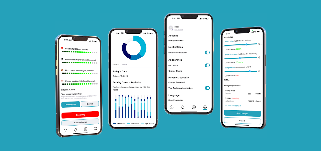
I designed more polished interfaces in Figma, focusing on usability and accessibility.

  • Real-time vitals display with clearer status states.
  • Recent alerts with timestamps and recommended actions.
  • Emergency response paths through app notifications and SMS.
  • User-friendly actions like false-positive acknowledgment and snooze options.
Vitals screen
Vitals display
Alerts screen
Alerts and actions
Onboarding screen
Onboarding
Dashboard screen
Dashboard
Activity screen
Activity
Voice assistant screen
Assistant
Settings screen
Settings

AI Training & Integration

I built a basic AI model using Teachable Machine to classify heart rate data into “Normal” or “Critical” using labeled screenshots.

The system was designed to map those AI classifications directly to interface behaviors, turning model output into meaningful user states.

Ethical Design Considerations

  • False-positive reporting to improve model accuracy.
  • Privacy and trust as core design constraints.
  • Clearer system behavior in urgent and non-urgent situations.
Teachable Machine training setup and mapped heart rate classifications
Training the AI model and mapping outputs into interface states.

Reflection & Learnings

This project reinforced how important accessibility, emotional context, and system trust are in healthcare experiences.

It also pushed me to think more critically about when design choices are about aesthetics versus when they directly affect comprehension and comfort.

Next Steps

  • Expand the AI dataset to improve generalizability.
  • Test the concept with real users for deeper validation.
  • Integrate wearable health devices for real-time monitoring.
Acknowledgments: This project was a collaborative effort as part of my INFO 693 Human-AI Interaction class at Drexel University. I had the privilege of working with Kamalesh Balan and Jay’llen Hathman.
Introduction 0%