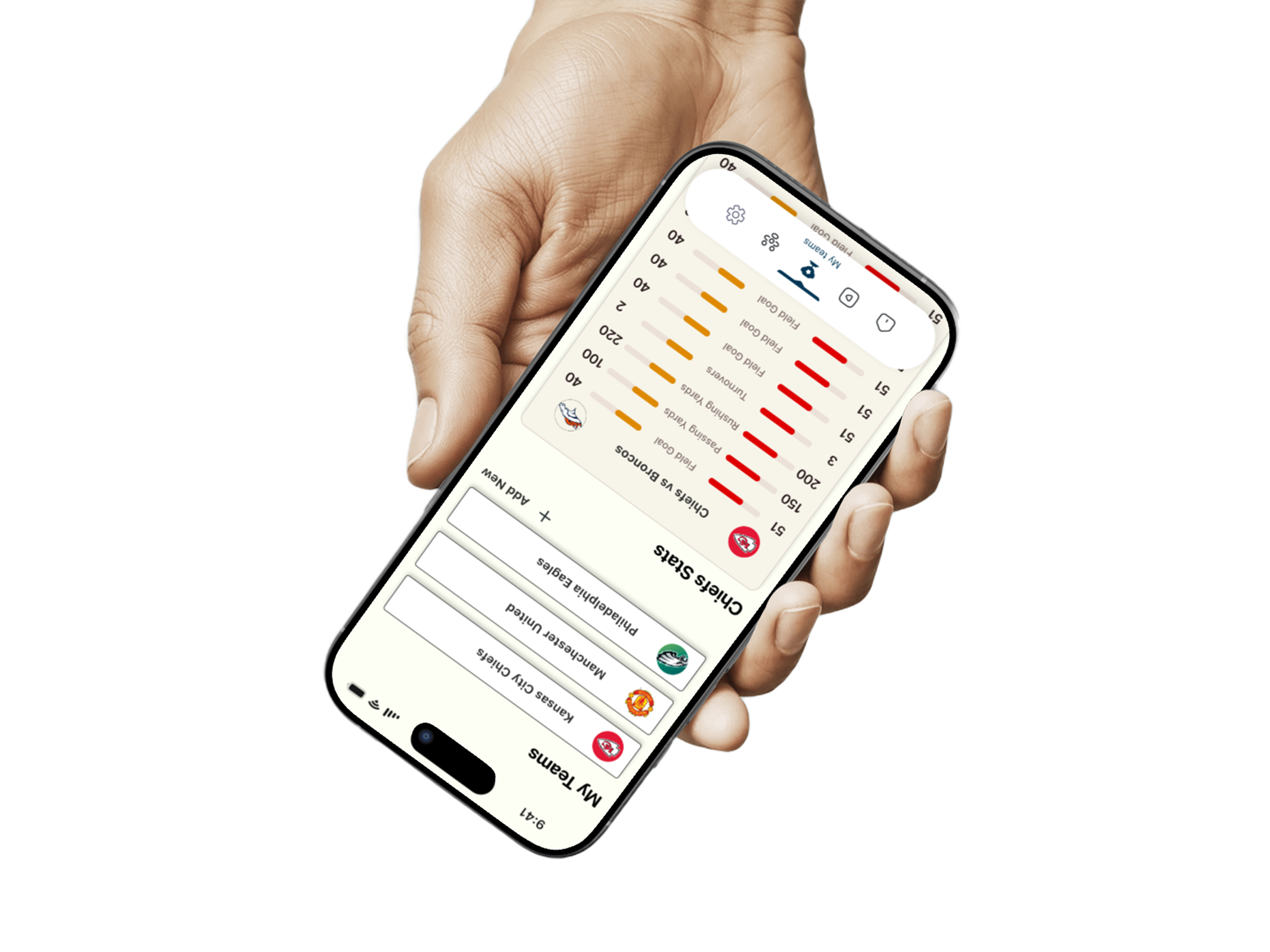
Key Design Decisions
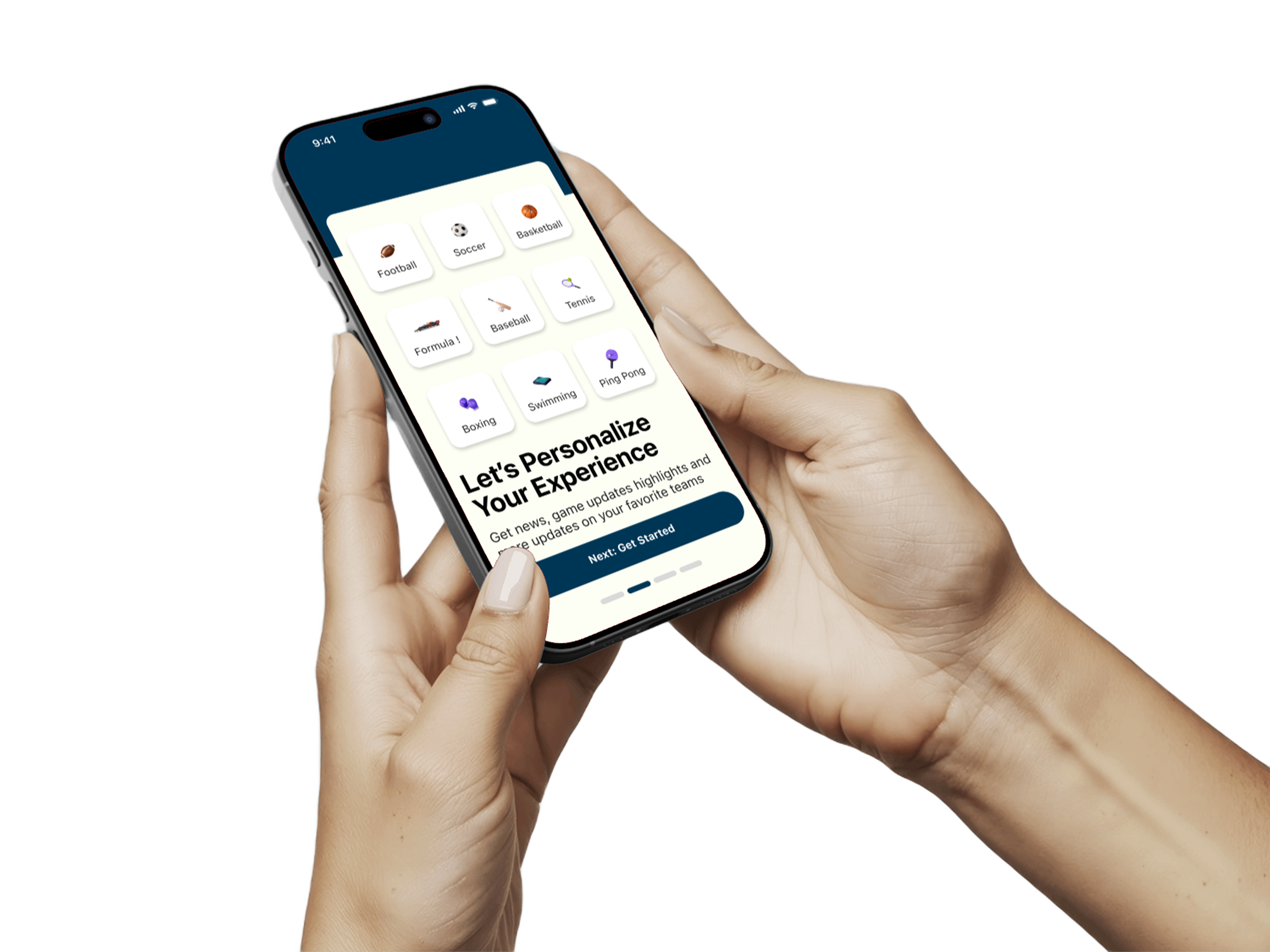
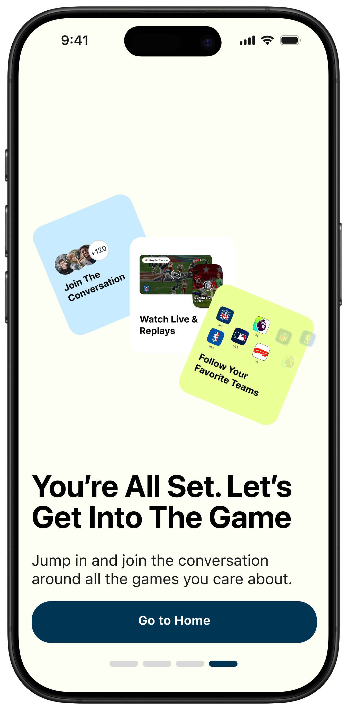
1) Reducing Friction in Onboarding
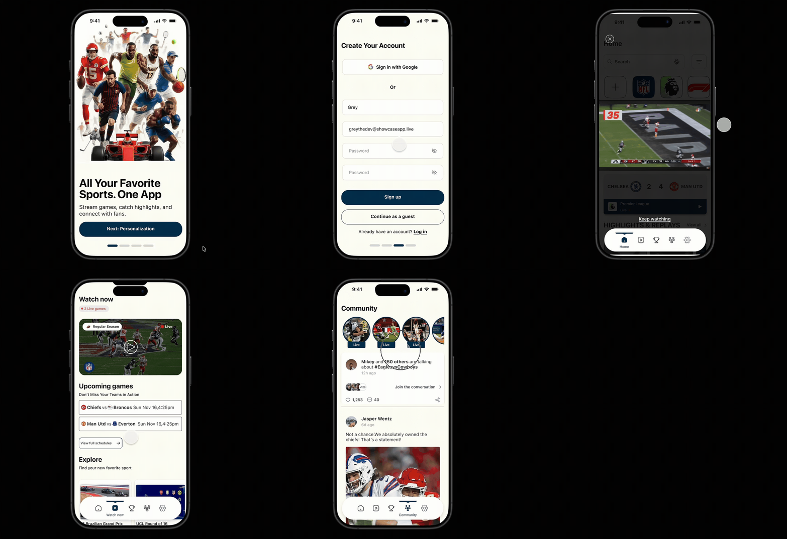
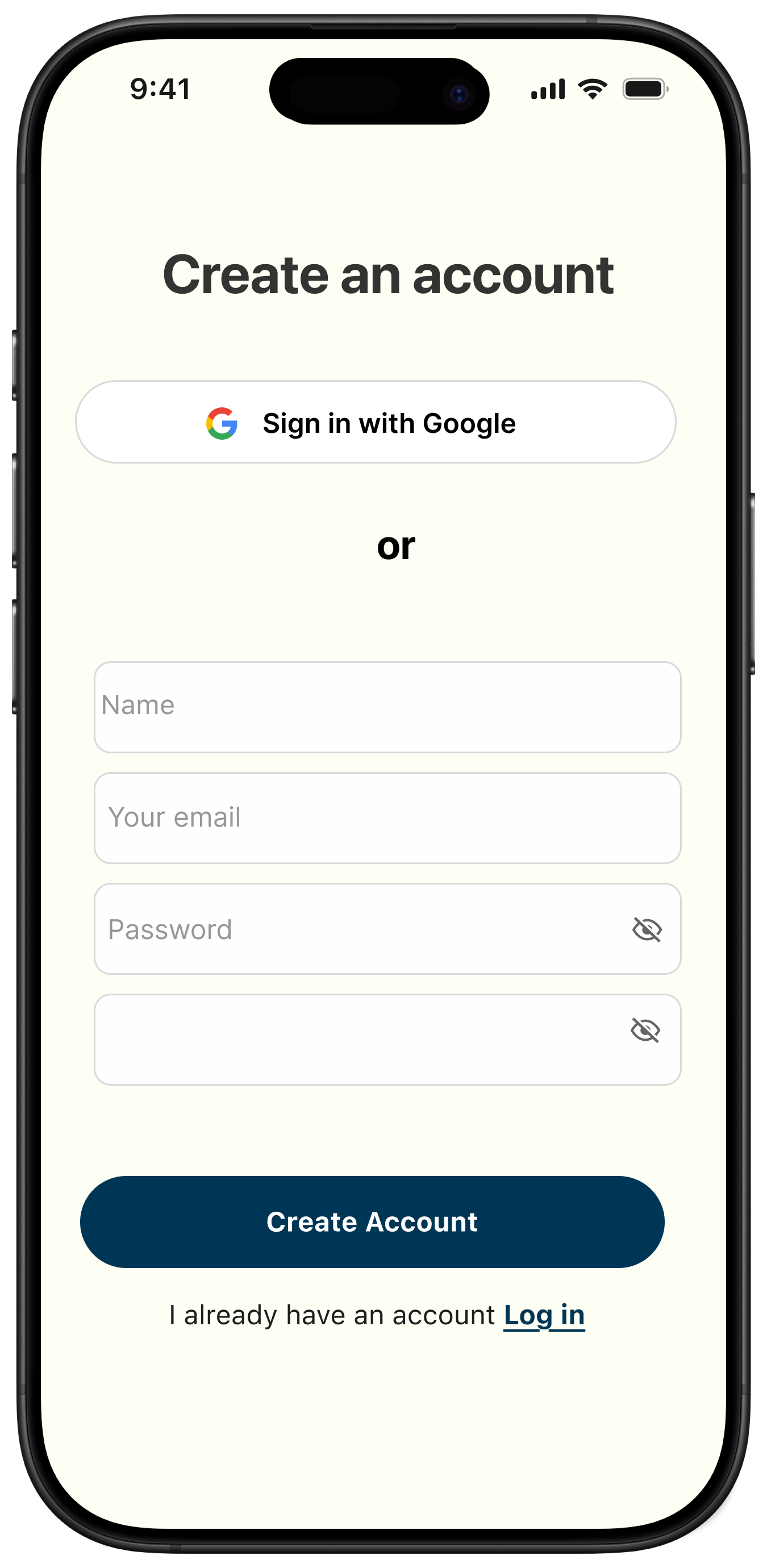
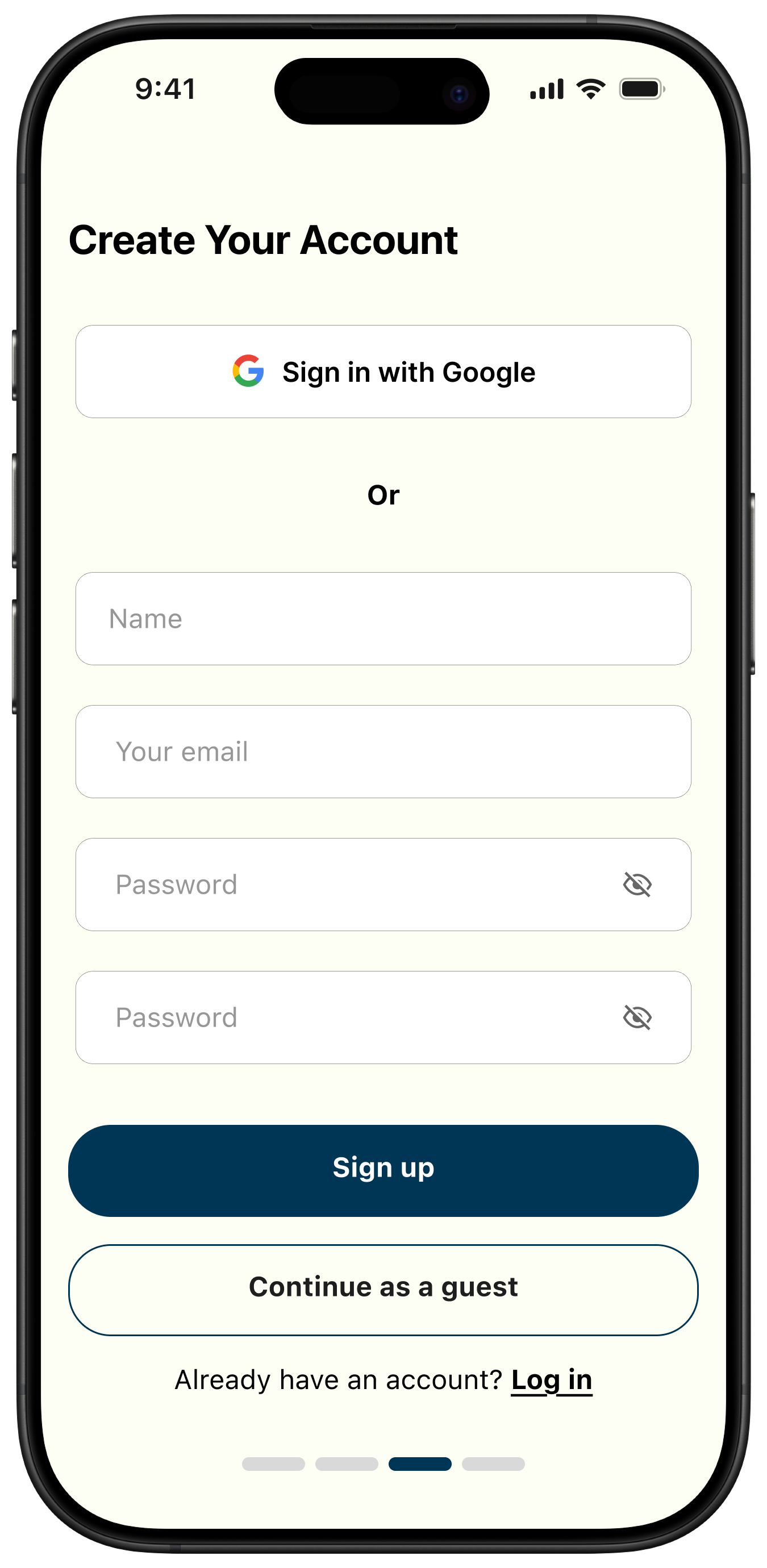
We introduced a Continue as Guest option so users can explore before creating an account. This reduces first-launch abandonment and builds trust before requesting data.
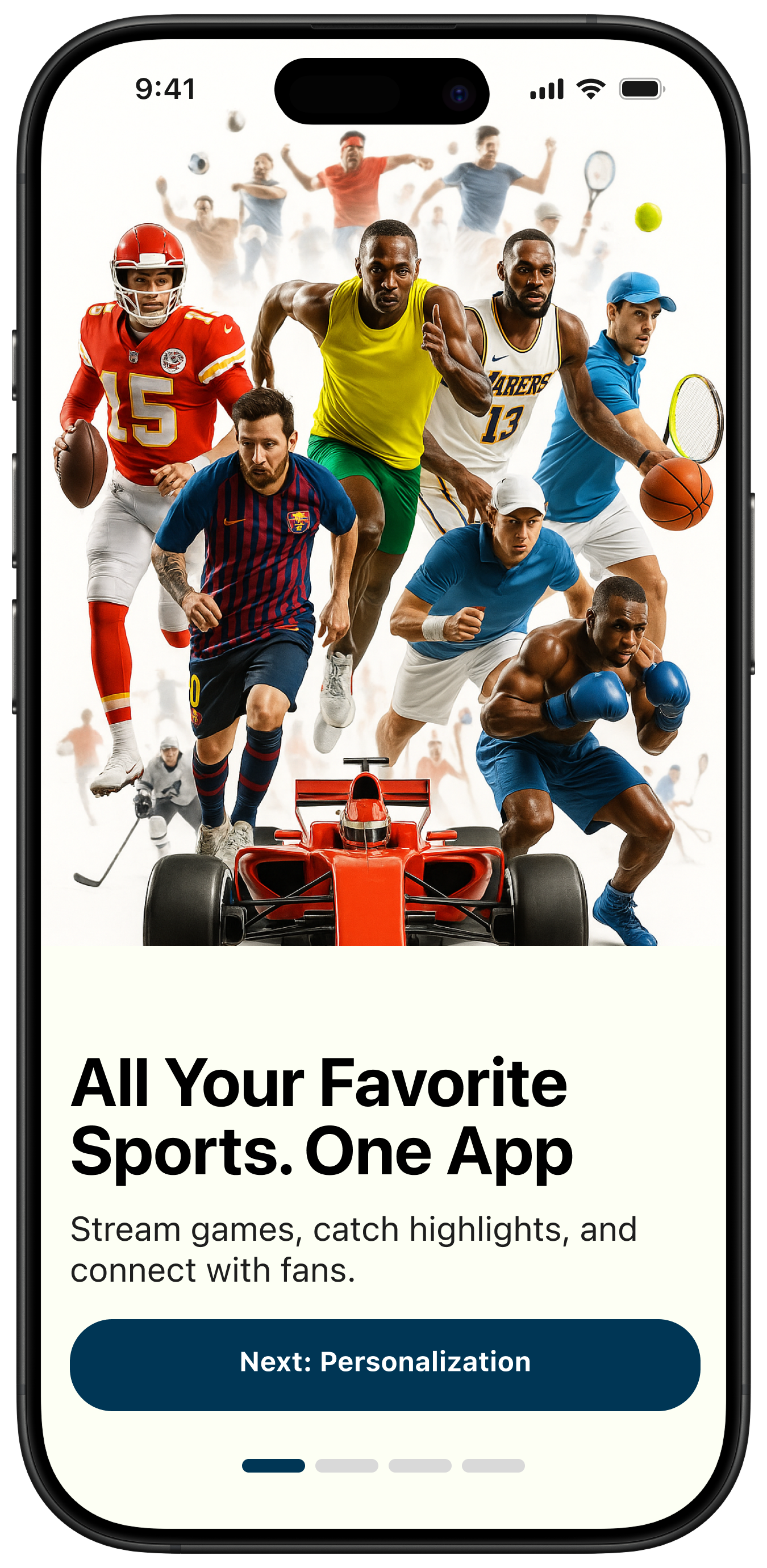
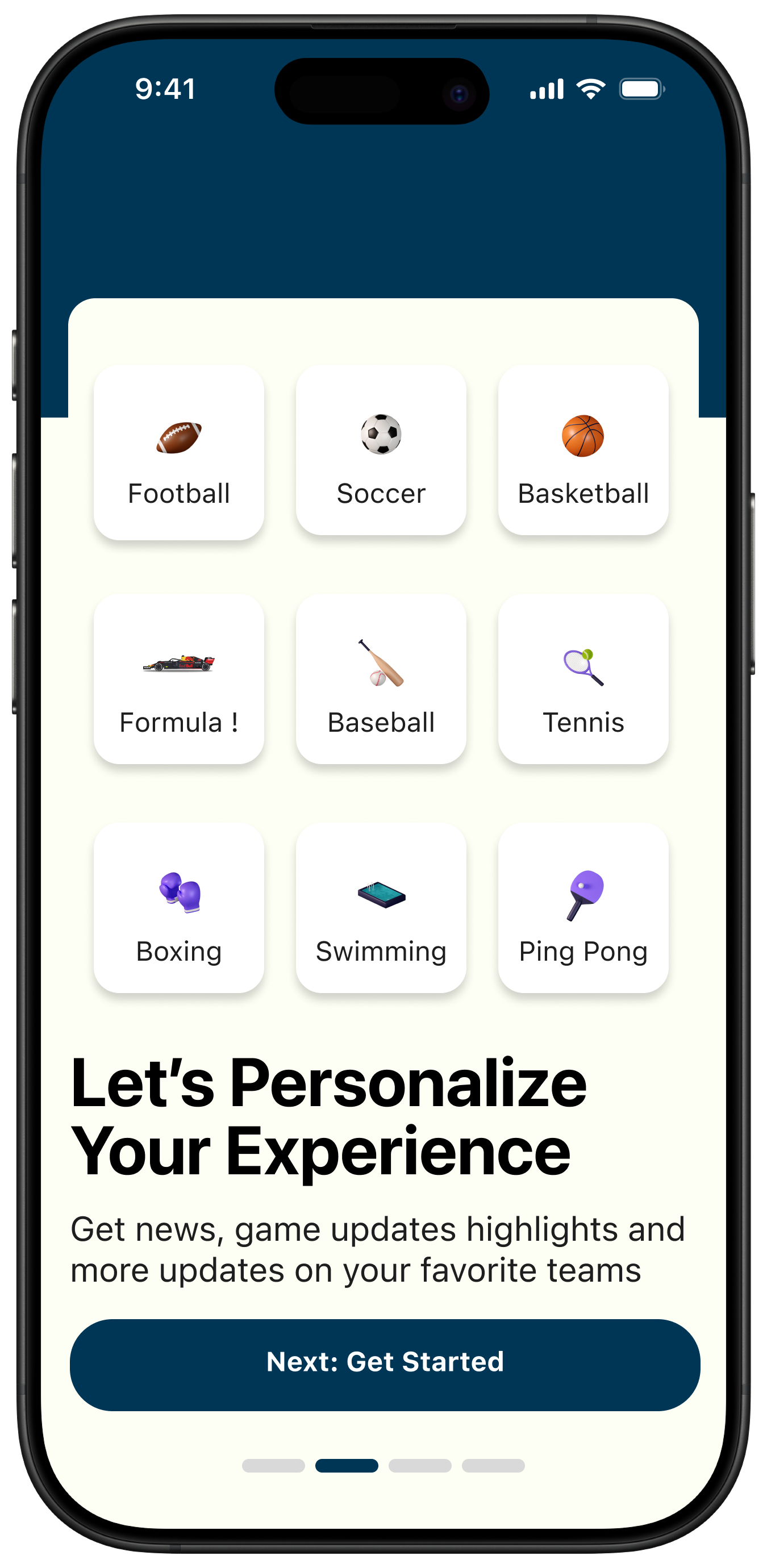
Intentional CTA Labeling
Instead of generic “Next” buttons, we labeled each action by what comes next: Next: Personalization and Next: Get Started.
- Sets clear expectations before users tap.
- Reduces uncertainty in multi-step onboarding.
- Improves completion by removing ambiguity.
- Creates clearer progress and direction.
Onboarding is where users decide if the app feels intuitive or overwhelming. Directional labels make the flow feel guided, not procedural, and while explicit step-labeling is most commonly associated with longer onboarding flows, we chose to apply it here to reinforce clarity and reduce uncertainty from the first interaction.
2) Navigation Iteration & Cognitive Load Reduction
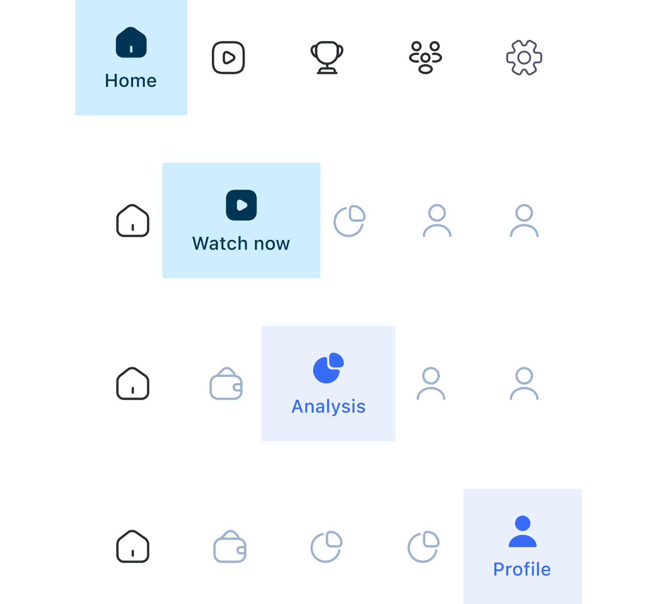
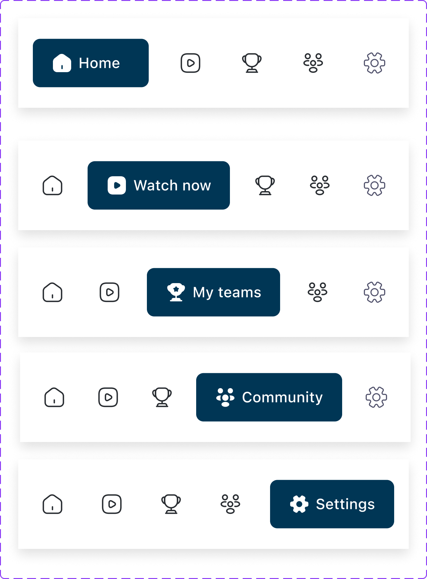
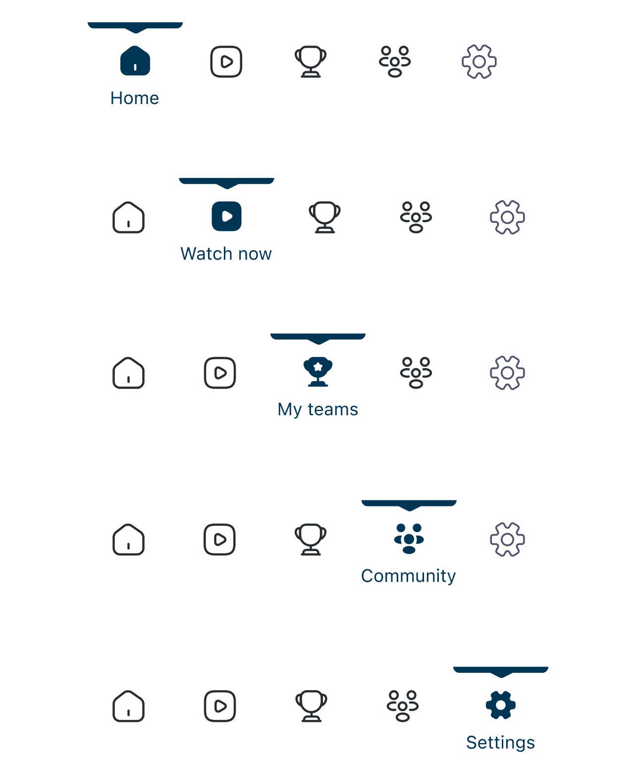
We explored multiple navigation bar structures before landing on the final layout.
Challenge: Greysports includes live viewing, teams, community, profile, and settings. Too many equal-weight destinations increase cognitive load.
Final approach: Clear icon hierarchy, consistent spacing/weight, and stronger active-state treatment for fast recognition.
The result improves scannability, supports thumb reach, and keeps feature density manageable.
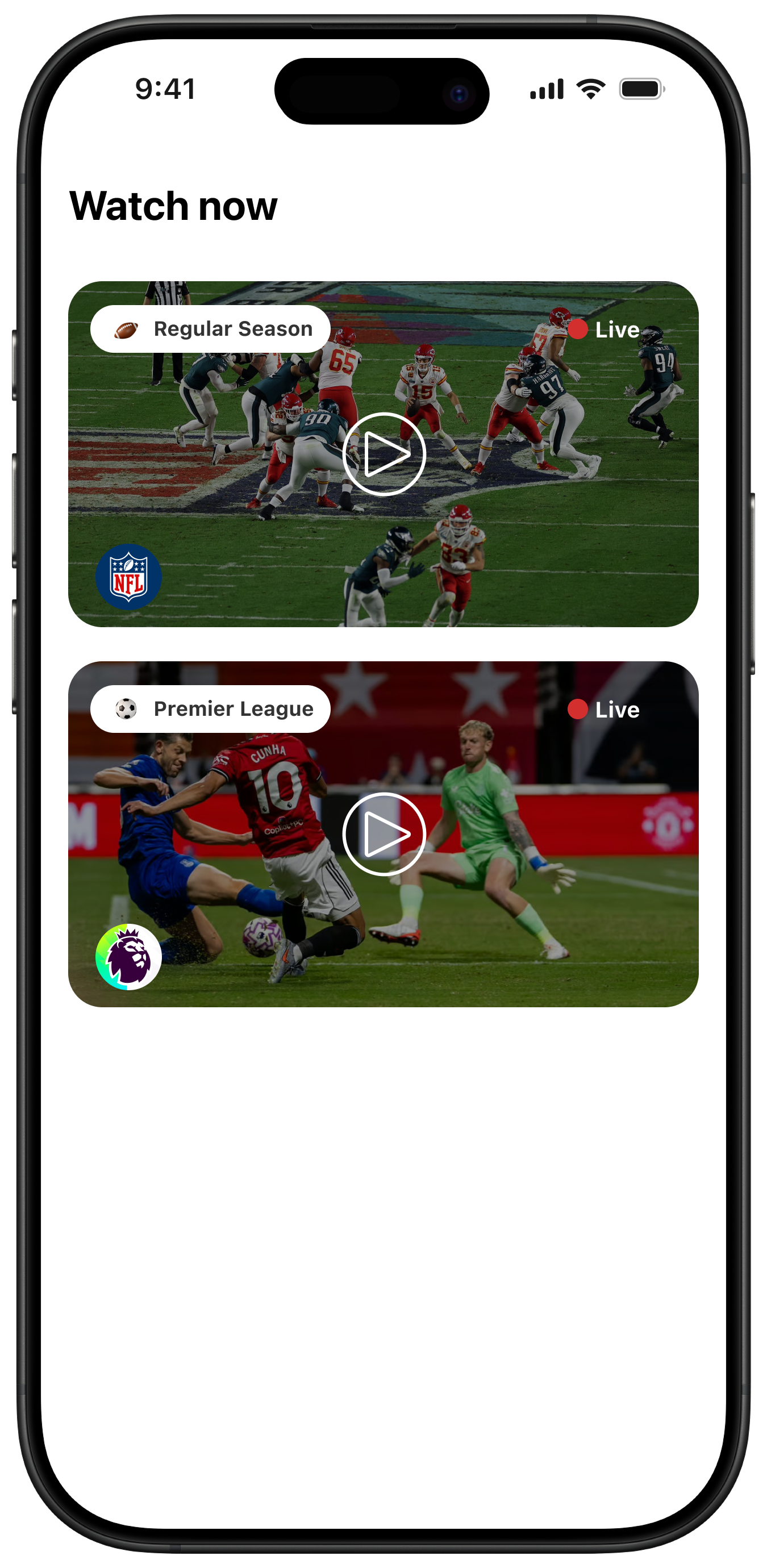
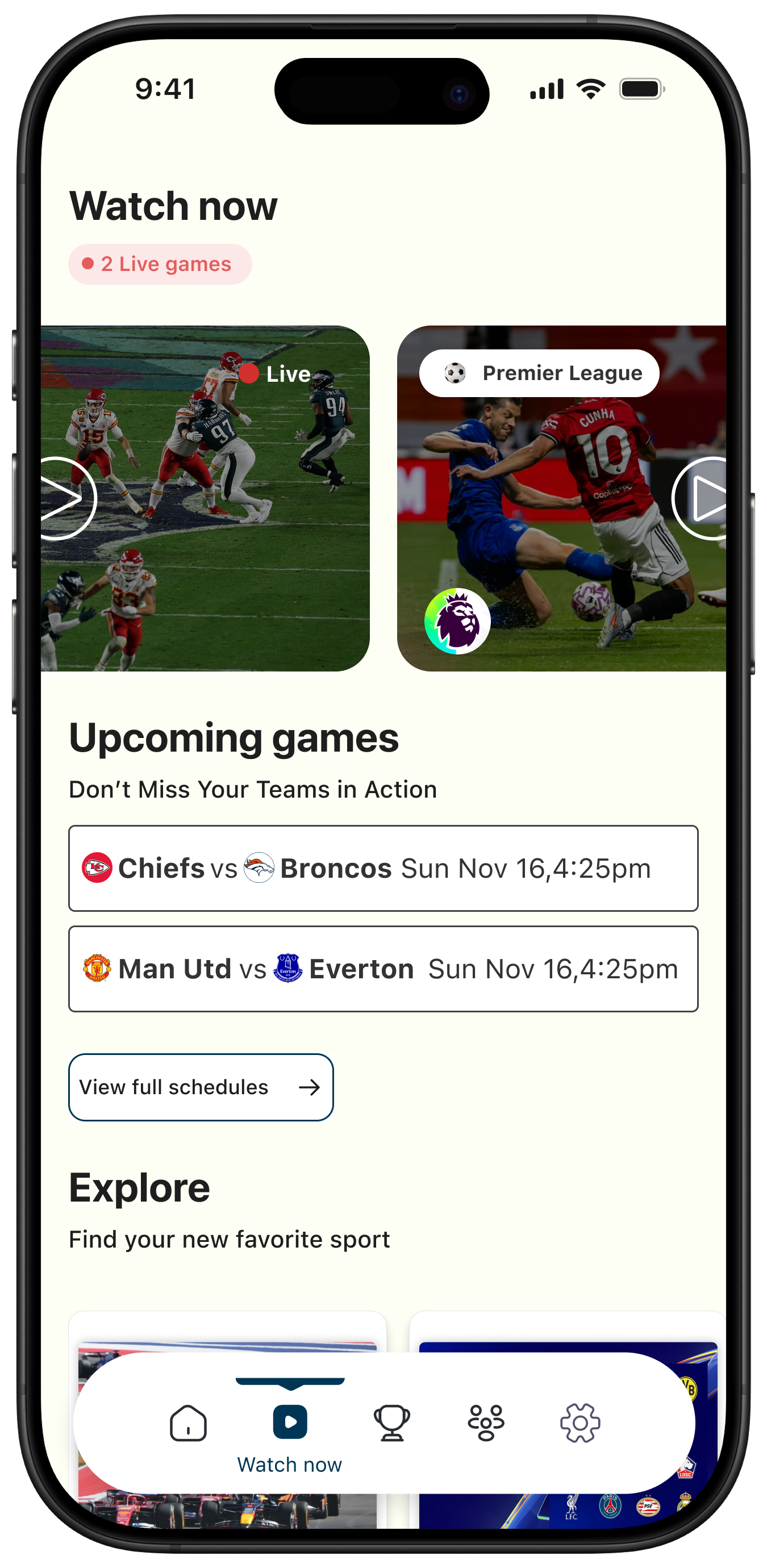
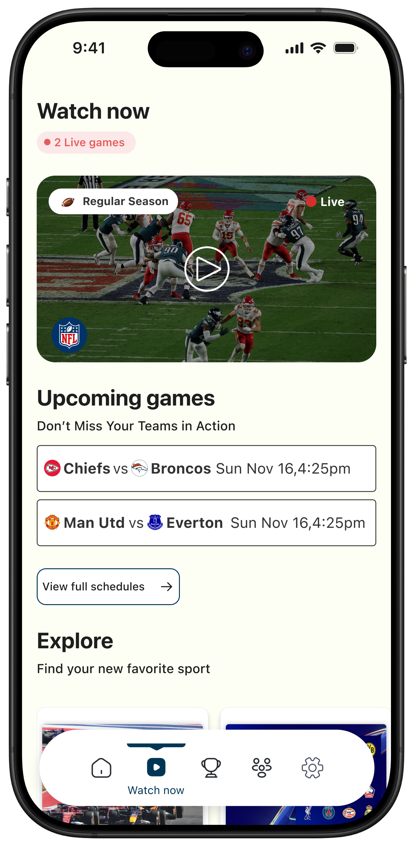
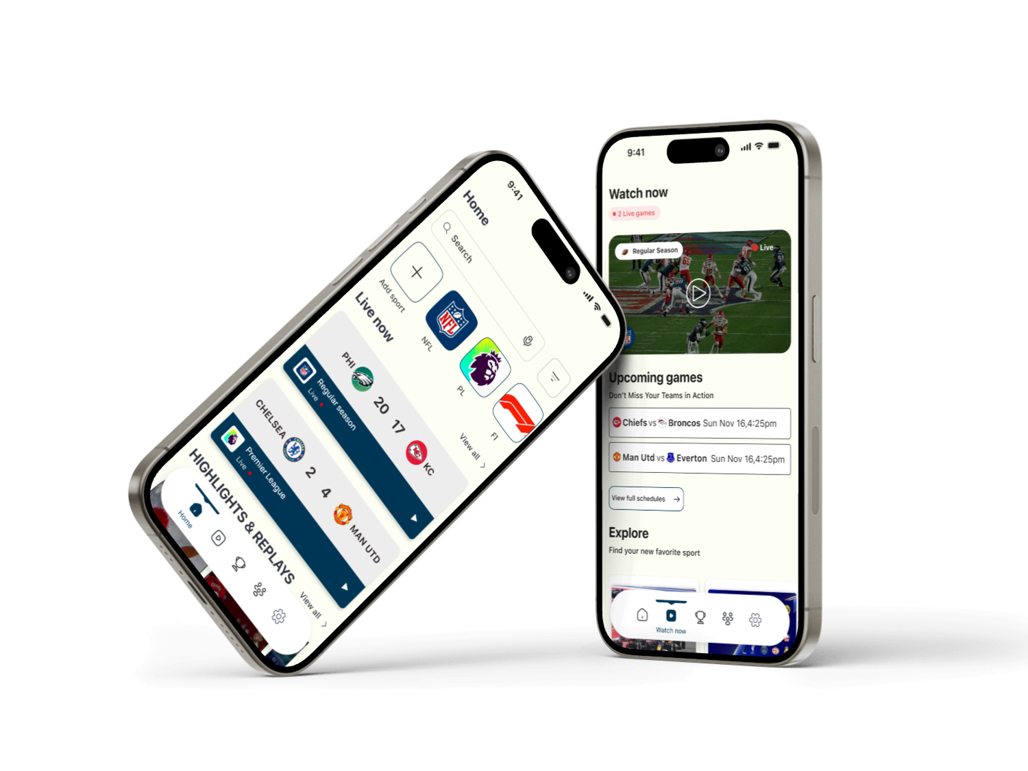
3) Live Games: Vertical Scroll to Horizontal Module
Initial state: Live games were stacked vertically and competed with the rest of the page.
Problem: Layout felt heavy, hierarchy weakened, and secondary content was pushed too far down.
Final decision: Move live games into a horizontal scroll module at the top to feature live content first while preserving vertical space for discovery.
- Clearer hierarchy and page rhythm.
- Better browsing space for updates and content.
- Familiar streaming behavior for faster comprehension.
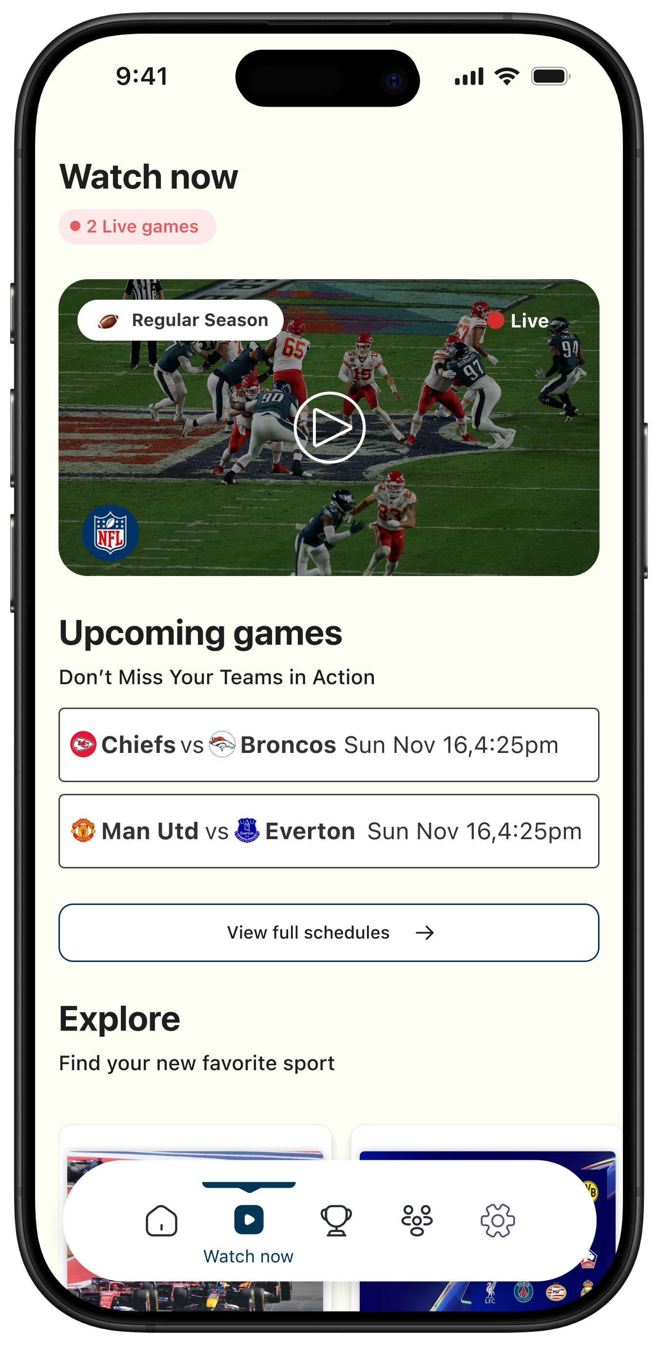
4) Full-Width Primary Action Button (Watch Now / View Full Schedules)
We redesigned the primary action button as full-width to strengthen emphasis and reduce hesitation.
- Stronger visual priority for the main action.
- Larger tap target for accessibility.
- Clearer intent in a dense interface.
In sports interfaces, clarity beats subtlety.
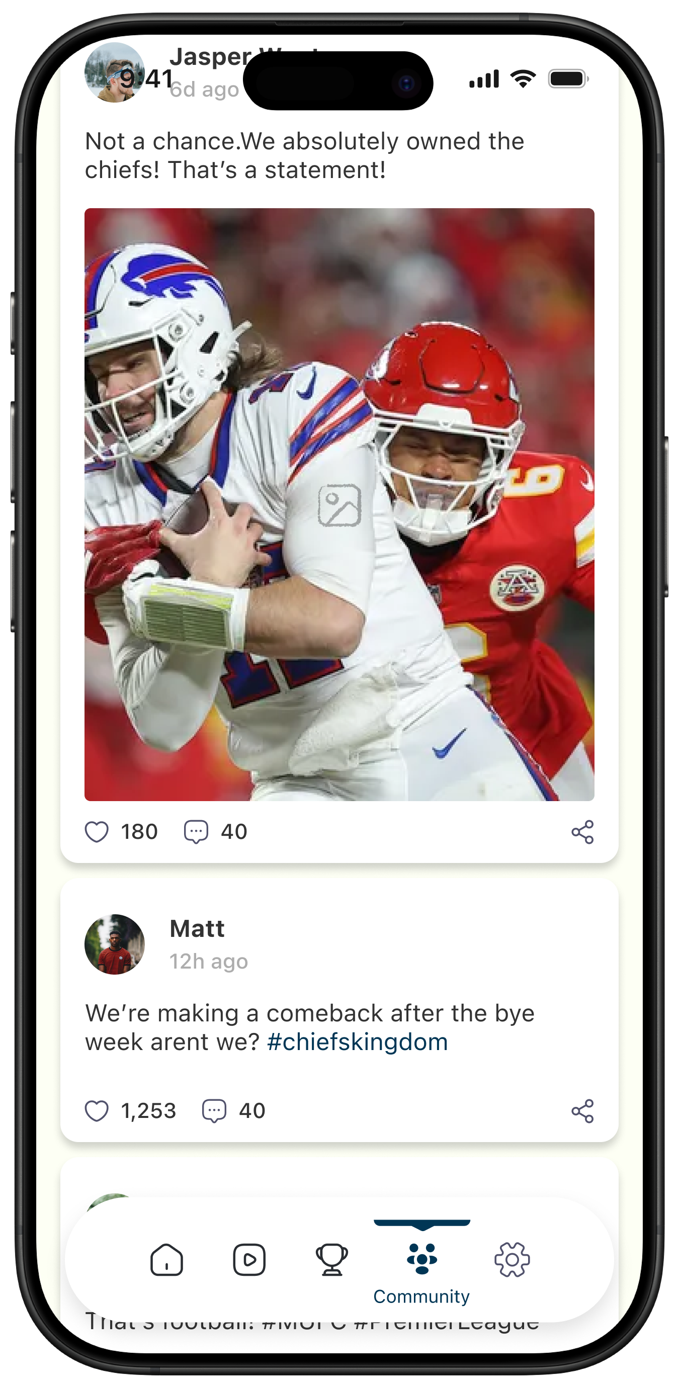
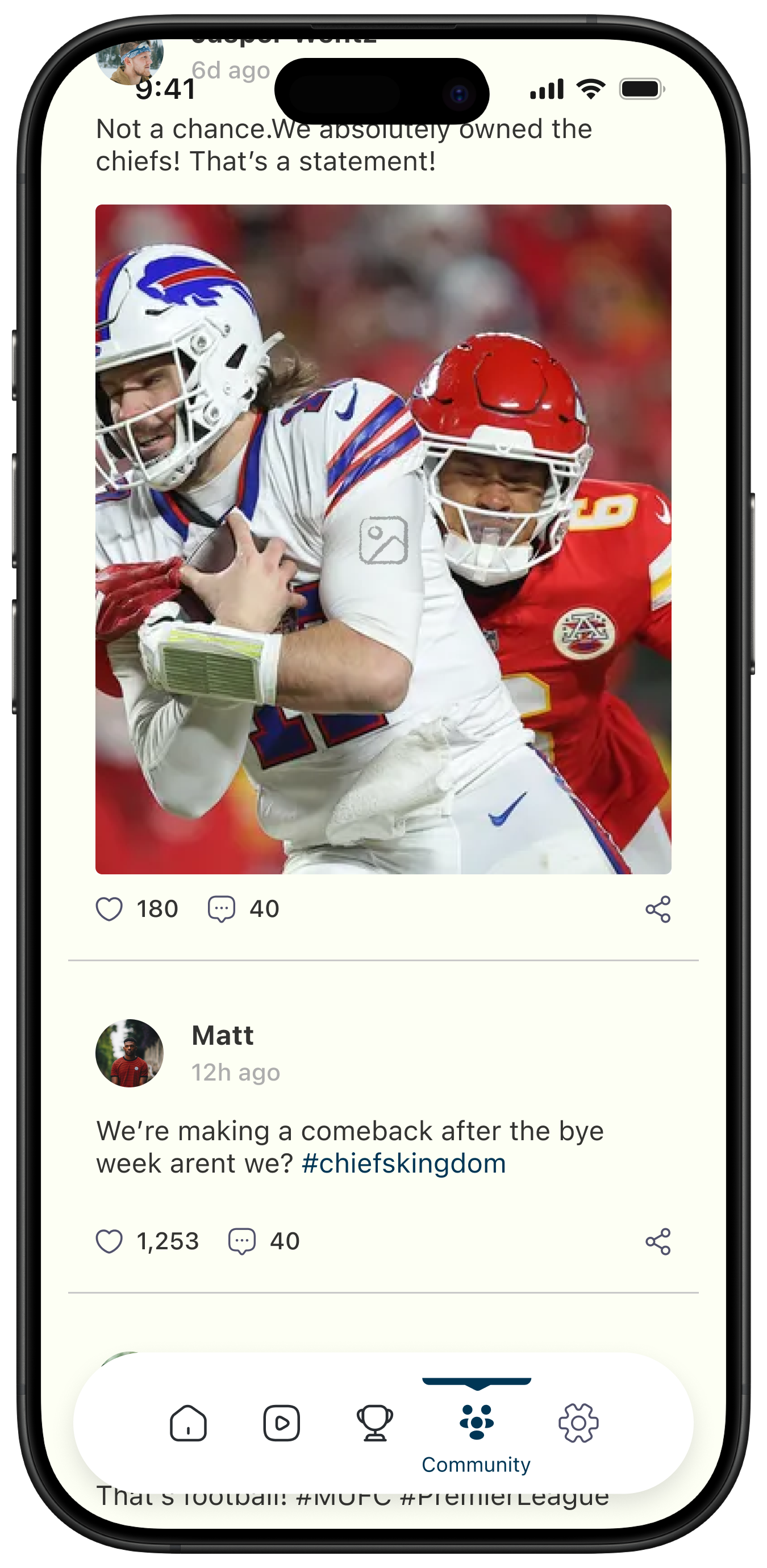
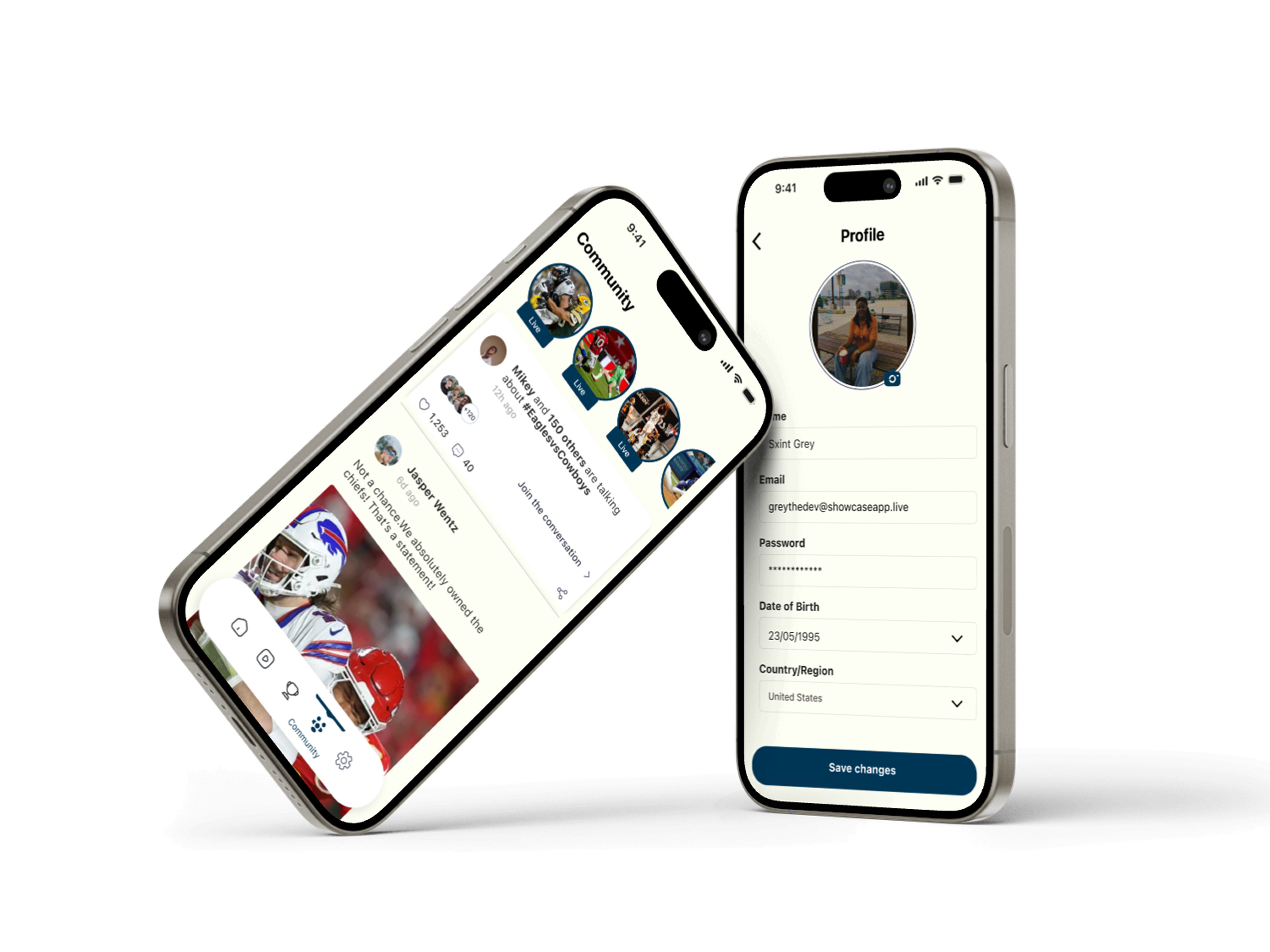
5) Community Feed: Maintaining Visual Continuity
During exploration, we tested white background cards behind each post for stronger separation. We ultimately preferred the more seamless background for the final experience.
Why white cards were not final: They felt heavier, segmented content, and added unnecessary layering.
Why final approach works: Lighter flow, stronger continuity, better visual breathing room for sports imagery, and faster scanning via spacing/typography/subtle dividers, an approach adopted by many top-level designers.
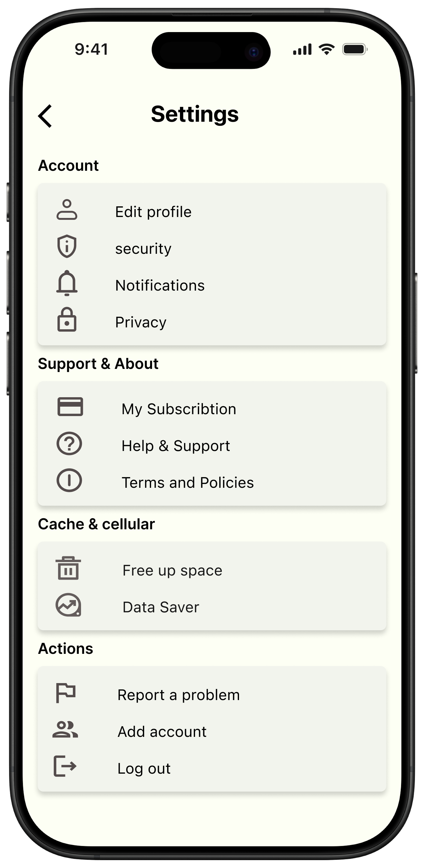
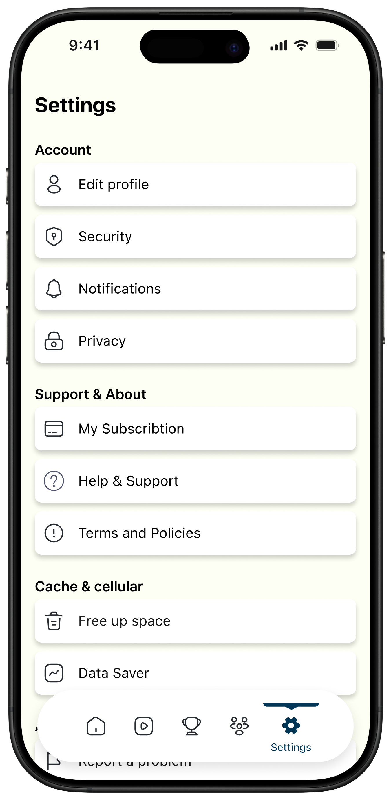
6) Settings: Clear Affordance Through Individual Containers
We explored grouped sections, but grouped options reduced interaction clarity and made rows feel less tappable.
Final decision: Each settings option sits inside its own white container.
- Clear affordance: each row reads as independently clickable.
- Faster scanning and easier task completion.
- Higher touch confidence and less ambiguity.
Settings is task-based; usability takes priority over visual minimalism.
Product Hypothesis
We designed Greysports around one core hypothesis: if live content and community interaction are integrated into one personalized interface, fan engagement time will increase compared to score-only consumption apps.
- Early personalization reduces irrelevant content.
- Horizontal live modules increase watch intent.
- Full-width primary actions increase interaction clarity.
- Clean post separation improves readability and scroll depth.
How We Would Measure It
- Time spent per session.
- Watch-to-click conversion rate.
- Community feed scroll depth.
- Repeat session frequency.